Brief
Choose a brand and create 3 style frames in the styles of two art movements. The first two frames will be Constructivist and Pop art respectively and a third frame that is the combination of both art movements.
Process
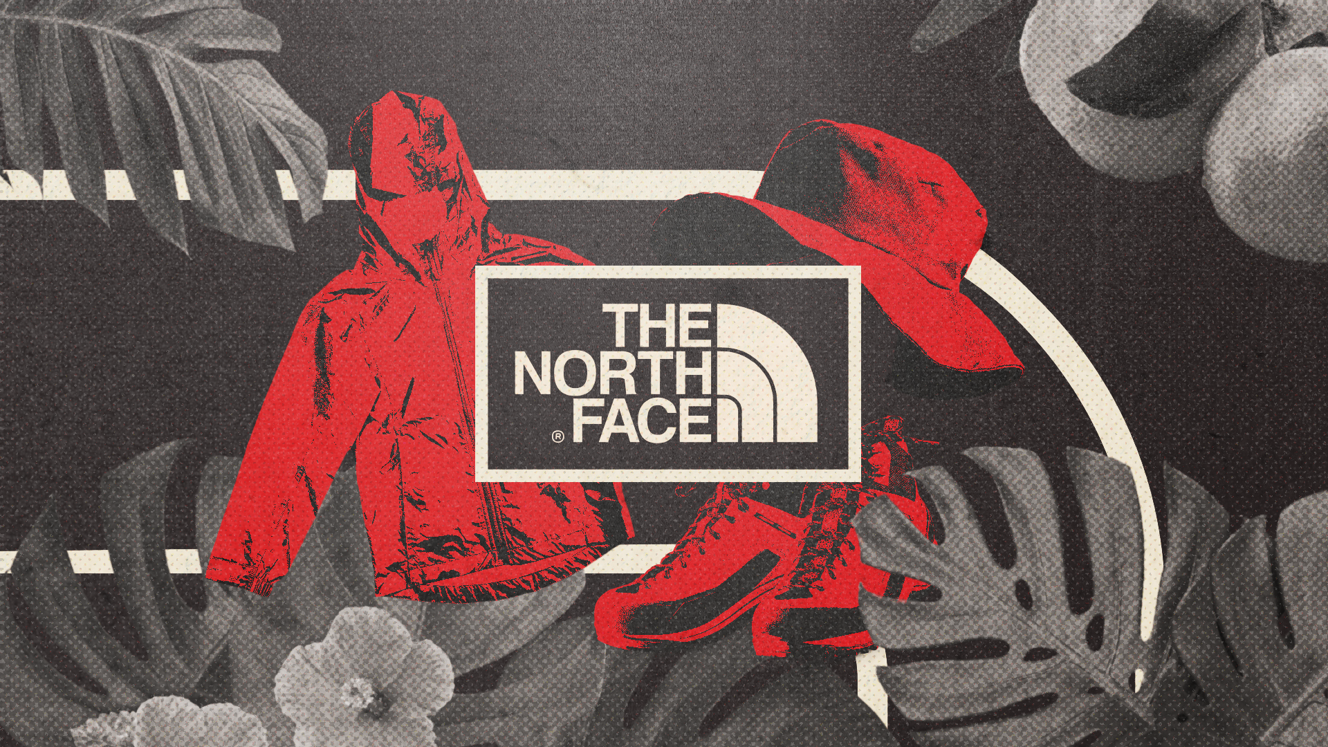
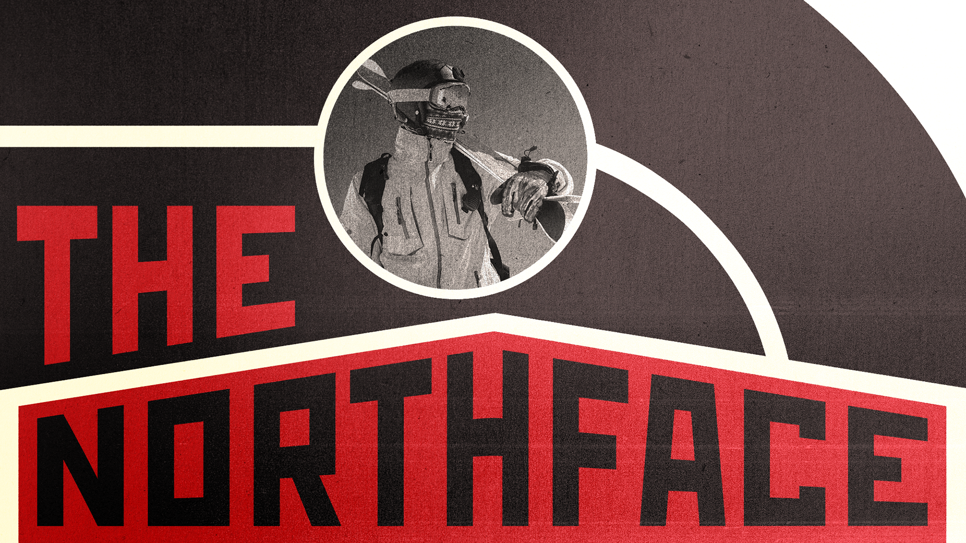
I chose The North Face as my brand for the project. Their branding happened to work really well because there products can generally be separated into two sections, rain and snow wear.
I started with constructivism. Often characterized with its bright primary colors, bold lines and geometric forms. I decided for this frame to be the "snow wear" frame because of the simplicity snowy landscapes tend to have.
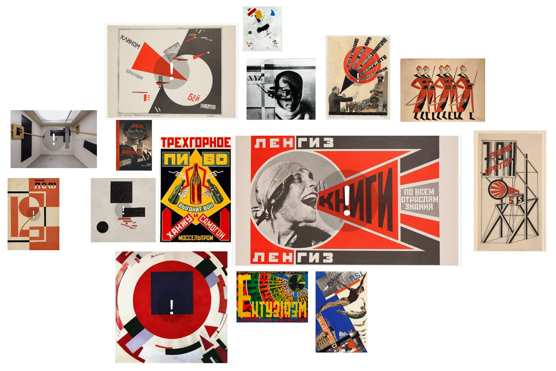
The Constructivist frame includes the logomark for the background, a skier in the center with The North Face taking inspiration from the work by Rodchenko named Books(Please!) in All branches of Knowledge. (mood board/references the bottom of the page) For the overall finish, my goal was to replicated the print and slightly yellow paper that a lot of these designs in Russia would be on during the time.
Process Cont.
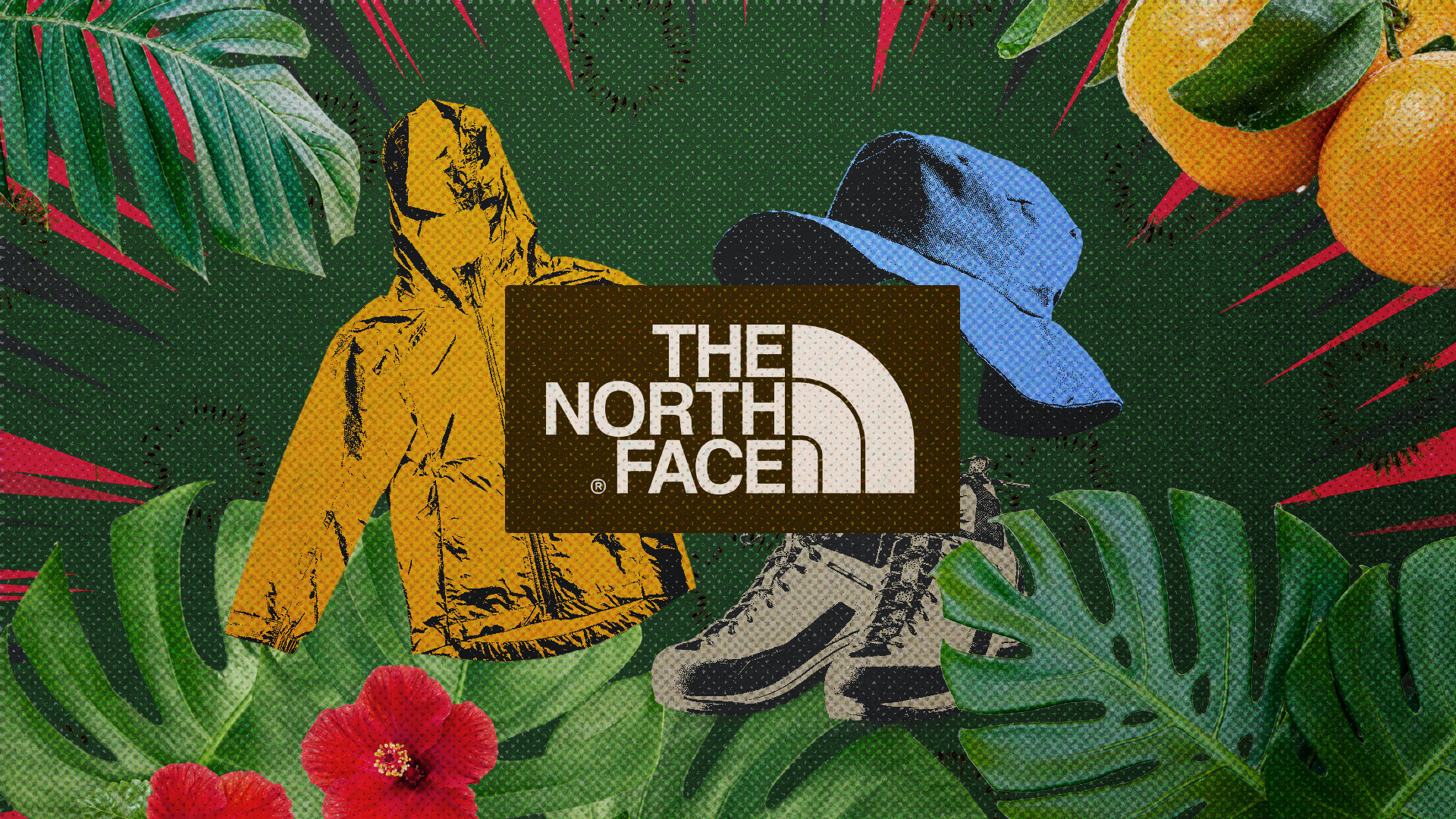
This second style frame is for the "rain wear" of The North Face" is based off of the Pop art movement. Within this movement, I chose to use its characteristics of recognizable imagery, bright and saturated colors, and mixed media.
I used elements that would be seen in the tropics such ass the big leaves, a flower and some fruit. Keeping consistent with the saturated colors but mixing in some earth tones to reinforce the suggested theme of this frame.
I also style the clothes to feel like they were from a comic or cartoon and overlayed the whole thing thing with a roughen halftone to bring everything together.
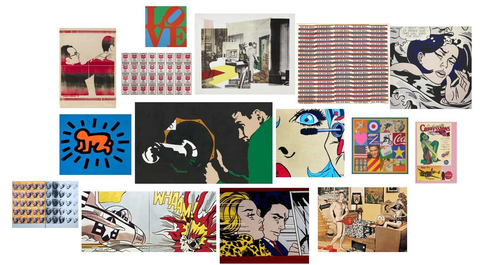
Reference/Mood board